
Statistics for decision-makers
Simpson’s paradox: when the average lies about your business
Every segment improves, yet the total gets worse. How a shift in the mix can reverse a KPI, what the classic cases teach, and how to read your own dashboards safely.
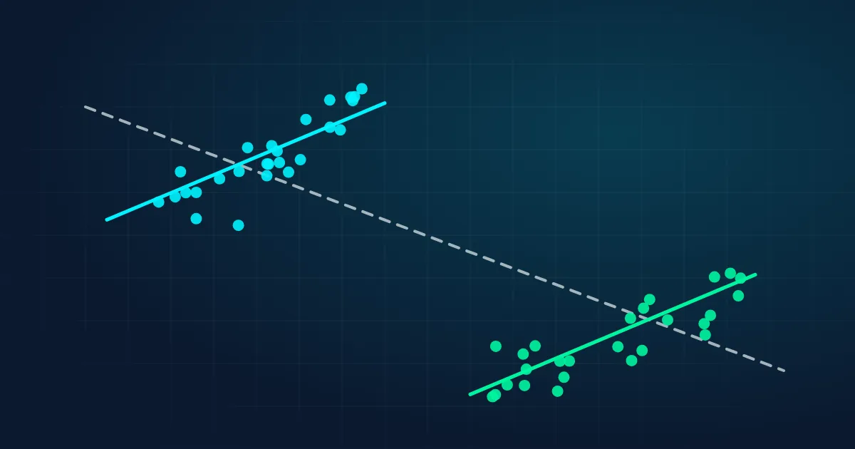
Your team launches a redesigned checkout. A quarter later, the dashboard shows that conversion went down, from 8.3% to 5.8%. The obvious conclusion is to roll the redesign back. But when you split the same numbers by device, the new checkout converts better on desktop and better on mobile.
Nothing is wrong with the spreadsheet. Both statements are true at the same time. This is Simpson's paradox: a trend that appears in every group of the data can disappear, or even reverse, when the groups are combined. It is one of the most common reasons why sensible-looking business reports lead to the wrong decision.
What Simpson's paradox is
An overall rate is an average of the group rates, weighted by how big each group is. So the overall number can change for two different reasons: because the rates inside the groups changed, or because the mix of groups changed. When the mix shifts towards a group with naturally lower results, the total can fall even while every group improves.
The paradox is named after the statistician Edward H. Simpson, who described it in 1951, although others had noticed the effect earlier. It is not a quirk of small samples or bad data. It follows directly from the arithmetic of weighted averages, and it shows up in large, clean datasets as often as in messy ones.
A classic example: two treatments for kidney stones
In a well-known 1986 study, doctors compared two treatments for kidney stones: open surgery (treatment A) and a less invasive procedure, percutaneous nephrolithotomy (treatment B). Looking at all patients together, the less invasive procedure seemed better.
| Patients | Treatment A: open surgery | Treatment B: less invasive |
|---|---|---|
| Small stones | 93% (81 of 87) | 87% (234 of 270) |
| Large stones | 73% (192 of 263) | 69% (55 of 80) |
| All patients | 78% (273 of 350) | 83% (289 of 350) |
Open surgery was more successful for small stones and for large stones, yet less successful overall. The reason is the mix: doctors tended to use open surgery for the difficult, large-stone cases and the gentler procedure for the easy ones. Treatment A was handed the harder patients, so its overall average looked worse.
The famous one: Berkeley admissions, 1973
In autumn 1973, the University of California, Berkeley admitted about 44% of the men and 35% of the women who applied to its graduate programmes. It looked like clear evidence of bias against women. When statisticians analysed the data department by department, the gap disappeared: in most departments, women were admitted at a similar or slightly higher rate than men.
The explanation, published in Science in 1975, was that women applied more often to highly competitive departments with low admission rates for everyone, while men applied more often to departments that admitted most applicants. The overall gap came from where people applied, not from how departments treated them. This does not settle every question about fairness, but it shows how misleading the single overall number was.
Try it: how traffic mix can flip your conversion rate
Back to the checkout redesign. In the example below (an illustration with made-up numbers), the new checkout in Q3 converts better than the old one in Q2 on both devices: 11.0% vs. 10.0% on desktop and 3.6% vs. 3.0% on mobile. In Q2, a quarter of the traffic came from mobile. In Q3, a social media campaign brought in a lot of new mobile visitors. Move the slider to change Q3's mobile share and watch the total.
With the same 25% mobile share as Q2, the new checkout wins overall: 9.2% against 8.3%. Above roughly 37% mobile traffic, the total turns against it, even though nothing about its performance changed. The campaign brought in more mobile visitors, and mobile visitors convert less on any checkout.
Why it happens: every average has weights
Σ (share of group × rate in group)
In the example: Q3 total = 30% × 11.0% + 70% × 3.6% = 5.8%. Q2 total = 75% × 10.0% + 25% × 3.0% = 8.3%.
Simpson's paradox appears when two conditions hold together. First, the groups have very different baseline results (desktop converts far better than mobile). Second, the groups are not equally represented in the things you compare (Q3 has far more mobile traffic than Q2). Whenever one variable affects both who ends up in which group and the outcome, the overall comparison mixes two effects together.
A useful habit is to split the total change into its two parts. If you apply Q3's segment rates to Q2's traffic mix, Q3 would convert at 9.2%: a rate effect of +0.9 points. The remaining −3.3 points are the mix effect, caused entirely by the shift towards mobile. The dashboard showed only the sum of the two: −2.4 points.
Where it shows up in business data
- Conversion and marketing. Device, channel, country and new vs. returning visitors all have different baseline conversion rates. A campaign that changes the traffic mix can move the total in either direction.
- Average order value and margins. A product range can grow its margin in every region while the company's average margin falls, because sales shifted to a lower-margin region.
- Sales performance. A sales rep who works mostly on large, difficult deals can have a lower overall win rate than a colleague who wins more often in both the small-deal and the large-deal segment, or vice versa.
- Quality and service metrics. Hospitals, call centres and support teams that take on harder cases can look worse on raw averages even when they do better case by case. This is why fair comparisons adjust for case mix.
- Churn and retention. Overall churn can rise while churn falls in every plan, if the customer base shifts towards cheaper plans that naturally churn more.
So which number is right?
Simpson's paradox does not mean that the segmented numbers are always right and the total is always wrong. The answer depends on the question and on how the variables are connected.
If the grouping variable influences both who gets the treatment and the result (as stone size did for the kidney patients), you should compare within the groups. If the grouping variable is itself a consequence of your decision, the total may be the right number. For example, if the new checkout caused desktop users to leave and come back on mobile, then the mix shift is part of the redesign's effect, and the overall drop is real. The computer cannot tell these situations apart from the numbers alone. You need to know how the data was generated. This causal view is explained clearly in Judea Pearl's The Book of Why.
A practical checklist
- Split every headline KPI by its main mix dimensions before you act on it: device, channel, region, customer segment, product line.
- Report a mix-adjusted number next to the raw one. Apply both periods' segment rates to the same, fixed mix. If the adjusted and raw changes point in different directions, the mix is driving your headline.
- Separate the rate effect from the mix effect in monthly and quarterly reviews. They usually have different owners: product teams own the rates, marketing and sales often own the mix.
- Randomise when you can. In a proper A/B test, random assignment keeps the mix the same in both groups, which removes this problem by design. Before-and-after comparisons do not have that protection.
- Ask how the groups were formed. If the split variable could be caused by your decision, think carefully before you "adjust" for it.
When a total and its parts disagree, the data is not broken. It is telling you that two different things changed at once.
The takeaway
An average always hides a mix. Most of the time the mix is stable and the average is a fine summary. When the mix moves, because of a campaign, a new market, a pricing change or a different type of customer, the average can tell a story that is the opposite of what happened inside each group. Splitting the numbers, adjusting for mix and thinking about cause and effect turns that trap into one of the most useful insights in a dataset.
Sources and further reading
- Simpson, E. H. (1951). The interpretation of interaction in contingency tables. Journal of the Royal Statistical Society, Series B, 13(2), 238–241.
- Bickel, P. J., Hammel, E. A., & O'Connell, J. W. (1975). Sex bias in graduate admissions: Data from Berkeley. Science, 187(4175), 398–404.
- Charig, C. R., Webb, D. R., Payne, S. R., & Wickham, J. E. A. (1986). Comparison of treatment of renal calculi by open surgery, percutaneous nephrolithotomy, and extracorporeal shockwave lithotripsy. British Medical Journal, 292(6524), 879–882.
- Pearl, J., & Mackenzie, D. (2018). The Book of Why: The New Science of Cause and Effect. Basic Books.